Flyoobe 3.03: The open-source tool that quietly reclaims your Windows 11 setup
The open-source tool from builtbybel gets a retro score bar, two new translations, and arrives alongside a warning about copycat sites.
When you boot a fresh copy of Windows 11, a wizard takes over. It walks you through language, network, an online account, privacy toggles, and what is essentially a rotating cast of ads dressed up as tips. For a lot of users, this feels less like setup and more like a set of defaults chosen for you, by OEMs preloading bloatware, by Microsoft selling advertising space inside the OS, and by convenience itself.
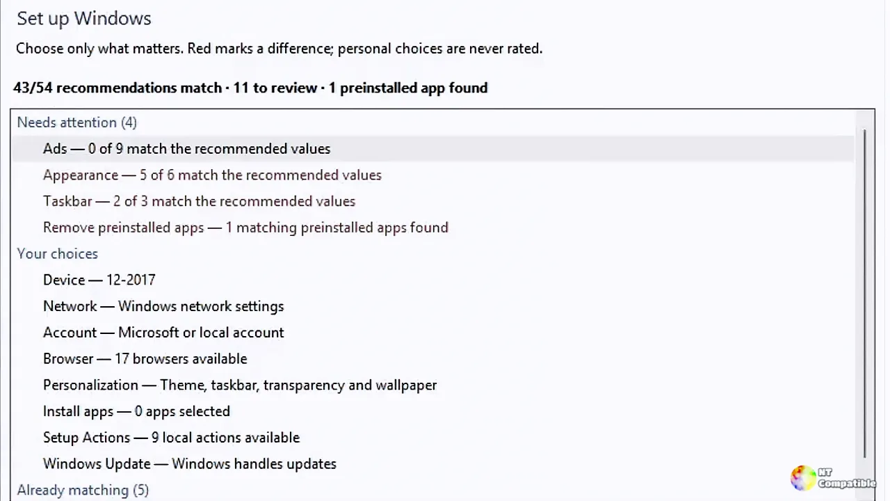
Into that gap steps Flyoobe. The open-source tool is now at version 3.03 (build 3.03.100), released today by developer Belim. It deliberately looks and behaves like the classic Windows Control Panel. No animations. No account needed to run it. A firm promise that "nothing leaves your PC."
Its job is narrower than you'd think, and arguably more useful for it. Flyoobe lets you install Windows on hardware Microsoft calls "unsupported," swap the forced Microsoft account for a local one, and kill the Start-menu ads with a single click instead of digging through a dozen registry keys.
What actually changed in 3.03
The headline new feature is a "setup rating." Flyoobe now hands you a base score for how closely your PC follows its recommendations, styled after the nostalgic Windows Experience Index — the old Vista and Windows 7 benchmark bar you probably haven't seen since a 2009 YouTube video. It lives in the first row under "Your choices" on the overview screen, which itself carries the score.
There's also a details pane that lists the actual differences rather than just counting them. It separates genuine deviations from matters of personal taste, which is a small thing that matters more than it should.
Other touches are the kind of detail only surfaces if you've actually annoyed yourself over them. The "More options" link is now its own heading so it reads unmistakably as a link. A search-clear button appears only when there's something to clear. And the search field is context-aware, relabeling itself "Search Control Panel" or "Search Flyoobe" depending on which page you're on.
New French and Portuguese (Brazil) language packs extend the tool beyond its English-first origins.
More polish than features
Most of 3.03 is about making labels tell the truth. The device row now describes what it configures instead of just echoing the machine name. The summary line shares its text with the tree row so the two can finally stop disagreeing with each other.
Counts are now honest too: settings are counted in the summary, areas in the group headers. The setup tree has picked up the Explorer theme — arrows instead of plus and minus boxes, softer selection highlighting, hover states. The status-bar version number dropped its leading "v," so it now reads 3.03.100 rather than v3.03.100.
There was one real fix as well. The settings page was failing to scroll all the way down, a regression that Flyoobe restored. A short page, scrolled properly. It's the kind of thing that never makes anyone's changelog highlight, but it's been biting people.
A design built on Windows 7 nostalgia
Flyoobe's interface choices aren't accidental. It uses native Windows controls, is "modern where that helps," but "borrows some clarity, color and friendliness from Windows 7 — the last Windows version that seemed to know where everything lived."
Concrete touches include an Explorer-style navigation bar with back, forward, breadcrumbs, and a shared page search, familiar blue page headings, white content areas, and a subtle blue-to-green accent evoking Windows 7.
The developer's changelog voice keeps reinforcing this. One line about live script output reads almost like a manifesto: "a frozen window is not a progress indicator. It is a trust exercise."
Its broader stance is anti-bloat and pro-transparency. Recommendations are file-based and readable, recipes avoid opaque embedded code, and the tool refuses to pretend to be an operating system with a custom skin. In an ecosystem crowded with one-click "Windows optimizers" that hide behind dark UIs, Flyoobe leans the other way. It's arguably competing on honesty rather than flash.
Head here to the GitHub release page.


